Design Awareness
By Mark Seymour
Kids, Do Try This at Home
Now that we've talked about some of the basics of design, let's use some. In this issue, we'll use those design principles to create a simple opening web page for a fictitious company. (That will keep the lawsuits to a minimum, rather than reworking something like, say, the www.microsoft.com site.)
The first thing is to name the company. There are firms out there that do nothing else; I once worked with a genius (his company is at http://www.namelab.com) who's still at it, thirty years later. Since this is the January issue, we'll do something appropriately winterish.
How about a winter sports equipment company? Skis, sleds, that sort of thing. We want to give a vaguely European feel to the company, so we'll use 'alpine' rather than 'mountain'. We want to imply more than just sporting goods (we might decide to sell clothing and climbing videos and tents, as well), so we'll use 'gear' rather than 'equipment'.
So, our company is called Alpine Gear. Except we're very hip and internet, aren't we? So we'll use the serial-capital version of the name, like any good computer company: AlpineGear.
A domain search did turn up a link to an existing company (http://www.alpinegear.com), but it's called Old Style Log Works, Inc., out of Kalispell, Montana. They build custom log cabins. If you're more curious than me, you can ask their web designer (http://www.snowdogweb.com) why they have their client linked to that particular URL. But, since they don't use Alpine or Gear or AlpineGear anywhere on their site, I'm sure they won't mind our borrowing the name for this project. Yet it's a good lesson; domain names are getting more scarce, and finding a good name that's also an unused domain is getting harder.
Now we have to create a logo for the company. Or, in this case, a logotype.
What's the difference? A logo is an icon, a picture, a 'bug' that communicates the image (and hopefully the name) of the company without any additional words. Think of the Shell Oil Company logo, the Apple Computer logo, and the International Business Machines Company logo. (I'd bet many of you didn't even know that IBM stood for International Business Machines.) A logotype is just the name used in a particular typography that, hopefully, also communicates the image of the company. Recent examples are the eBay logotype, the Google logotype, and the Yahoo! logotype, complete with its own punctuation.
Why use a logotype rather than a logo? Mere personal preference, some of the time; either your own or that of the CEO of the company. But you'll notice a pattern in the companies selected above: the ones that have a product (something that needs an immediately recognizable sign on a building or on a box on a shelf) use logos, and the ones that are service providers use logotypes. It's not a perfect system, however; Ace Hardware (definitely a product company) uses a logotype and many banks (definitely service companies) use a logo. Since our company is going to sell many products, most of them produced by other companies, we'll go with a logotype.
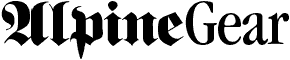
We want to emphasize the 'European' quality of the company, so we'll pick the only font typically recognized by Americans as 'Euro', one usually referred to as either Old English or German Black Letter, for the 'European' half of the name:

This is a font called Berliner. The image was created in Photoshop, but the letterspacing was hand-tightened because the standard spacing looked too 'open', and the capital A didn't look much like an A, except to a 19th-century German. (Logotypes must be grasped as images, rather than 'read' as words, and if the letters are farther apart it tends to invite letter-by-letter 'reading' by the viewer.)
For the 'equipment' half of the name, we'll use something that's not too technical looking, something comfortable, that suggests our stuff is fun and easy to use:
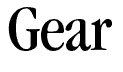
This is ITC Garamond Book Condensed, also with tightened letterspacing. It also had to be scaled, because letter proportions are not the same in all fonts; at 72 points, the capital G was much larger in this font than in the Berliner. We picked Book Condensed because it gave us a similar width-to-height ration for the lower case letters. Not perfectly, but optically. You'll find a lot of things that 'look' right never measure 'right'...
Now we have our logotype:
It needs to appear in color, in most usages, so we'll need to pick them. We might as well come up with a 'color way' for our site at the same time. A 'color way' (the industry term for a series of colors to be used together) is merely the list of colors (whether PMS numbers for printing inks or hex values for the Web) that will reinforce the image we wish to show our customers.
We want to look precise (like the Swiss), but fun-loving (like the Italians). Yet we don't necessarily want to use particularly 'national' colors, with their flags (red and white for the Swiss and green, white, and red for the Italians) providing the most recognizable colors for each country. We do want to look high-tech, and definitely ready for the mountains. We don't want to look like rocks or dirt (brown), because that's what you fall on. So we'll rely on the standard mountain-evoking colors of blue (mountain air and streams) and white (snow), along with old reliable high-tech gray:
Note that we've chosen several different related blues and a couple of grays, using our favorite VisiBone swatch set; you'll eventually need to present information in varying levels, whether in a brochure or a website, and having a preset color way will help you organize it faster.
Let's see what happens when we apply our color way to our logotype:

We'll also want to use it on colored backgrounds, so we need at least one more variant:

Now let's look at the basic landing page for the company. (Click the small white box at the top of the page to return here; it's not part of our design. These pages have also been optimized for an 800x600 display, so set your browser to display that size if your resolution is higher.) To the basic page, we'll now add the logo. And then some simple navigation. We'll put in some page links. Finally, we'll display one of the links, an internal directory page, which points to further specific pages on the topic of High-Altitude Gear.
Note that we've used, to a modest extent, our color way to help guide the viewer. Other than using bold to show navigation, we've deliberately left out font specifics on the sample pages, but if you wanted to use particular fonts you could render the text as PNGs. (The gradient, of course, would require making the images with transparent backgrounds.) We've also set up a simple yet flexible navigation system, which would allow for potentially hundreds of pages in this on-line catalog.
The product pages for this site will require better definition of the use of the color way, along with setting the style of the illustrations and/or photographs and the text required to describe the objects in the catalog. Next month we'll cover some of those aspects.
I hope this has given you some things to think about in your own design work. As ever, if there are specific topics you'd like covered in future columns, don't hesitate to email me.
I started doing graphic design in junior high school, when it was still
the Dark Ages of technology. Bill Gates and Steve Jobs were both eleven
years old, and the state of the art was typing copy on Gestetner masters.
I've worked on every new technology since, but I still own an X-acto knife
and know how to use it.
I've been a freelancer, and worked in advertising agencies, printing
companies, publishing houses, and marketing organizations in major
corporations. I also did a dozen years [1985-1997] at Apple Computer; my
first Macintosh was a Lisa with an astounding 1MB of memory, and my current
one is a Cube with a flat screen.
I've had a website up since 1997, and created my latest one in 2004. I'm
still, painfully, learning how web design is different from, but not
necessarily better than, print.
![[BIO]](../gx/authors/seymour.jpg)
